 So, it looks like we now know what Facebook has been up to with its crazy spree of acquiring photo-sharing startups like Lightbox and Instagram. Yesterday, while I was driving up to the ol’ beach house for the day, I checked my Twitter feed and was notified of the news that Facebook released a new app for iOS, appropriately called Camera. Desperate to download it before moving out of 4G range, I pulled into a gas station just short of what I call The Void, the point beyond which no data shall pass. So I parked, sat and waited while the app downloaded, much to the chagrin of my friends.
I put in some heavy use yesterday, and quite frankly, Camera is one of the best photo-sharing apps for iOS that I have ever used. Camera holds this distinction for a number of reasons, including its design, powerful and understated photo editing functionality, and its obscene speed and efficiency.
If you want my one-sentence opinion of Camera, here it is: Facebook’s camera is a gorgeous, well-executed photo-sharing application that isn’t a chore to use. And that’s that. But in case you want to hear about why it’s not a chore to use, do feel free to read on.
Let’s start with the user interface. When users first open the app, they see a feed of their friends’ recent photo-sharing activities on Facebook, including those done through third-party apps to which users have linked their Facebook account. At the top is an array of squares, the leftmost one of which toggles “camera mode” and the other three containing the three most recent photos on your iPhone, whether it was taken with Camera or not.
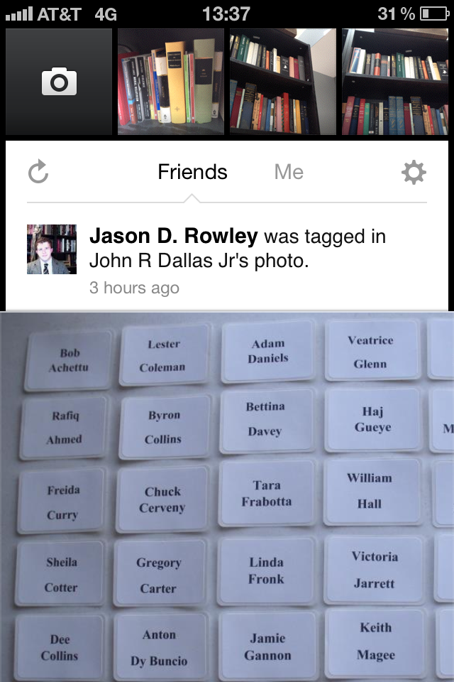
The home screen
If the user slides the stream upward, they can go explore the photo feed. Think of it like the News Feed on the main Facebook iOS app minus all the non-photo posts on a black background with the Like and Comment buttons placed subtly on the bottom of the photo, so as to place more focus on the images on the stream. Users can navigate batches of photos by swiping left and right. And users also have the option to toggle between looking at their friends’ photo stream and their own with a single tap – a task which takes two taps on Instagram.
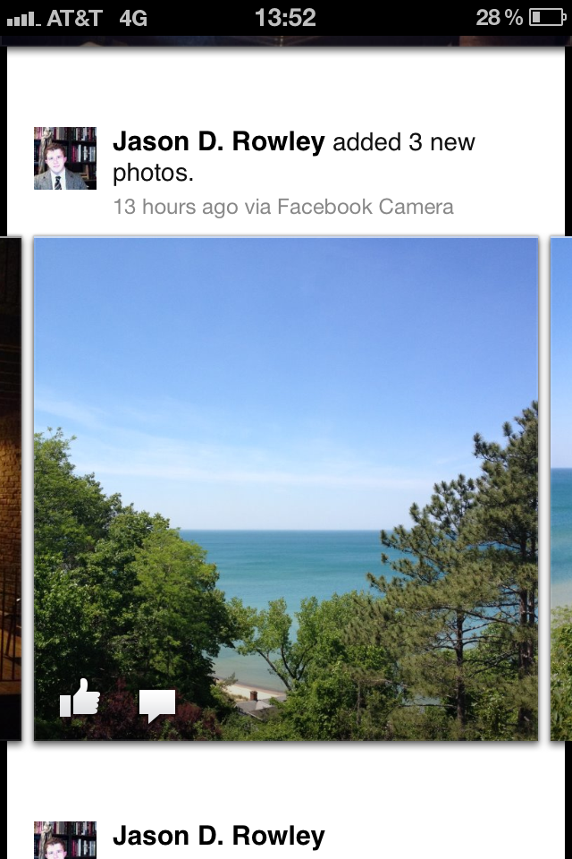
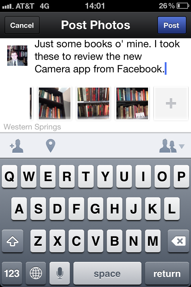
Swipe left or right to see the other photos.
But if the user pulls the stream downwards, an array of photos appears. Sharing one photo or multiple photos is as easy as selecting which ones you want to share and posting them; writing captions and tagging friends and locations are all optional. And users, for the first time on any of Facebook’s products, are able to save drafts of posts.
There isn’t necessarily anything new or interesting about “camera mode,” aside from the fact that it takes full advantage of my iPhone 4S’s fast, high-resolution camera. The only inconvenience is that I can’t use my phone’s “volume up” button like a shutter button, like I can in the standard camera app in iOS.
And as for editing, it’s very easy. Cropping and straitening happen all in one tool, and users are given the ability to apply vintage-inspired filters to their photos. In classic Facebook style, the filters are minimally-intrusive, unlike some of Instagram’s; Camera’s filters let users tweak their photos without being garish about it, and the decision to not include the option to add a border is, at least to me, welcome.
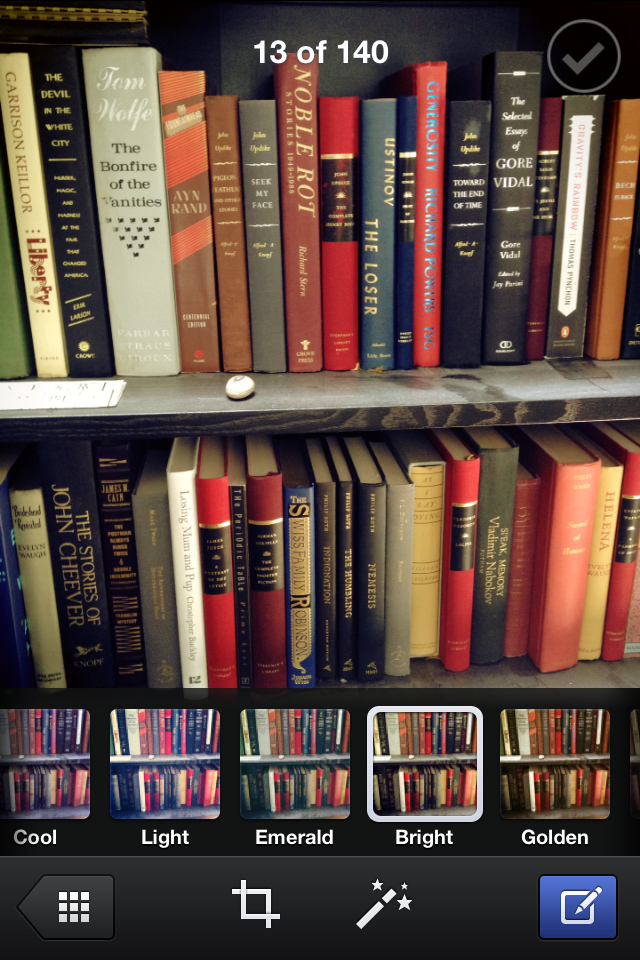
A look at some of the filters.
Sharing large numbers of photos is as simple as pulling down the feed to reveal the photo selection tool, which allows you to select and share the photos stored on your iPhone.
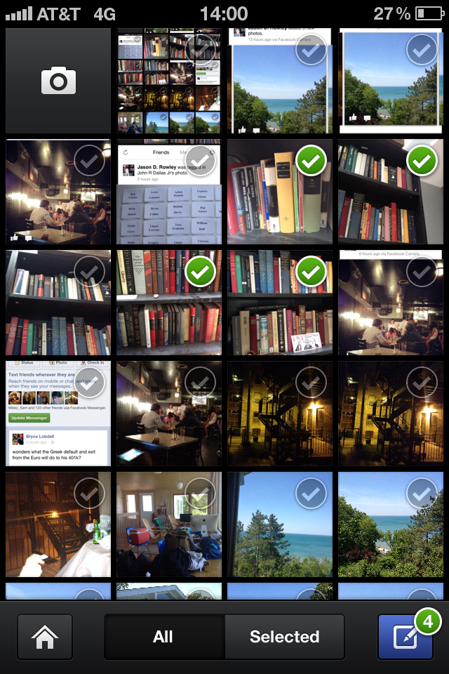
Just tap the little circles to select.
And then it’s just a matter of actually posting those photos, which is as simple as hitting the little blue button on the bottom right.
You can write a caption or leave it out.
It takes a little bit of time to get used to the interface, but when you do, you realize just how broken sharing photos from the Facebook mobile app actually is. Overall, there’s one thing about Camera that sticks out to me, and its the fluid, flexible and dynamic nature of the app. Fluid, because it reduces the number of prompts, dialog boxes and busy work which makes sharing more than one photo on Facebook’s primary iOS app about as fun as trepanning yourself with a butter knife and a mallet.
Flexible, because sharing five photos is as easy as sharing fifteen, and because tagging and captioning remain optional. (Instagram forces you to “say something” about the photo in order for you to publish it.) And dynamic, because navigation isn’t limited to a single vertical stream; because photos upload in the background; and because of its largely gesture-based – as opposed to Instagram’s strictly button-based – navigation, and because, again, it’s blazing fast.
I find myself comparing Camera to Instagram with some hesitance. On the one hand, I can sympathize with some customer reviews from the iOS App Store which say that Camera is not a replacement for Instagram. Instagrammers are their own community, culture and aesthetic values. And that’s okay. But I argue that Camera wasn’t built to compete against Instagram, because Camera fills a gap that Instagram never sought to address: namely, the problem of sharing more than one photo at a time from a mobile device. It doesn’t matter that the two apps share some of the same features.
For all of Facebook’s missteps with its flagship mobile app – which I personally find baroque and yucky, to be all technical about it – Camera is a shining example of what the company’s talented engineers and designers are capable of building for mobile devices.


